PONS Tech Co
Point of Care Ultrasound Technology
Timeline: February 2021 - August 2021
Role: Digital Marketing & Design Intern
Skills: Brainstorming, research, wireframing, lofi-prototype, visual design
Tools: Figma, Illustrator, Photoshop, Wix
INTRODUCTION
PONs specializes in producing wearable ultrasound technology that monitors illnesses and diagnosis remotely. By making medical equipment accessible and affordable for end-users, patients can receive pre-hospital diagnosis and contact their doctors before making a trip to a hospital or clinic, both saving valuable time and money.
PROBLEM STATEMENT
As a new start-up, PONS needed to present themselves professionally to end-users and investors for funding. There was a simple 3 page website and minimal content regarding how their technology works, who it’s for, and how to use it. Most of the web pages had repetitive content, confusing imagery, and lots of medical jargon. Most users found it difficult to understand what the company was, what was the product, and how it works in the healthcare realm.
SOLUTION
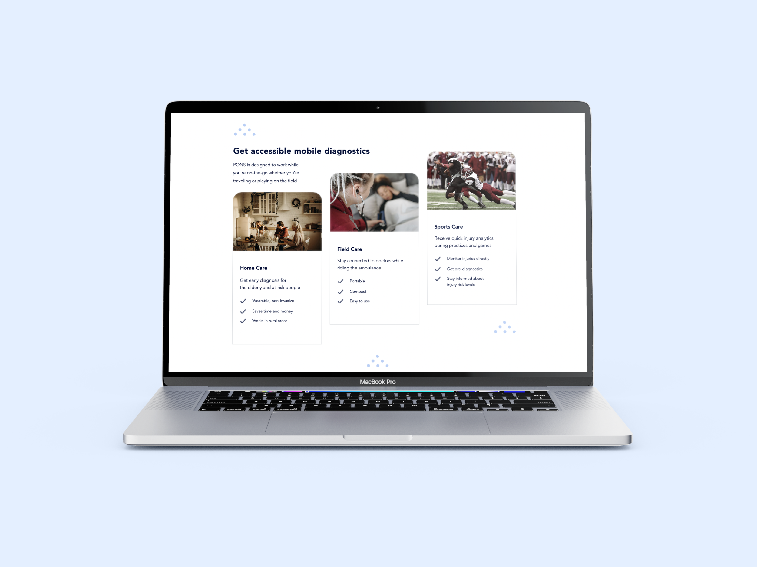
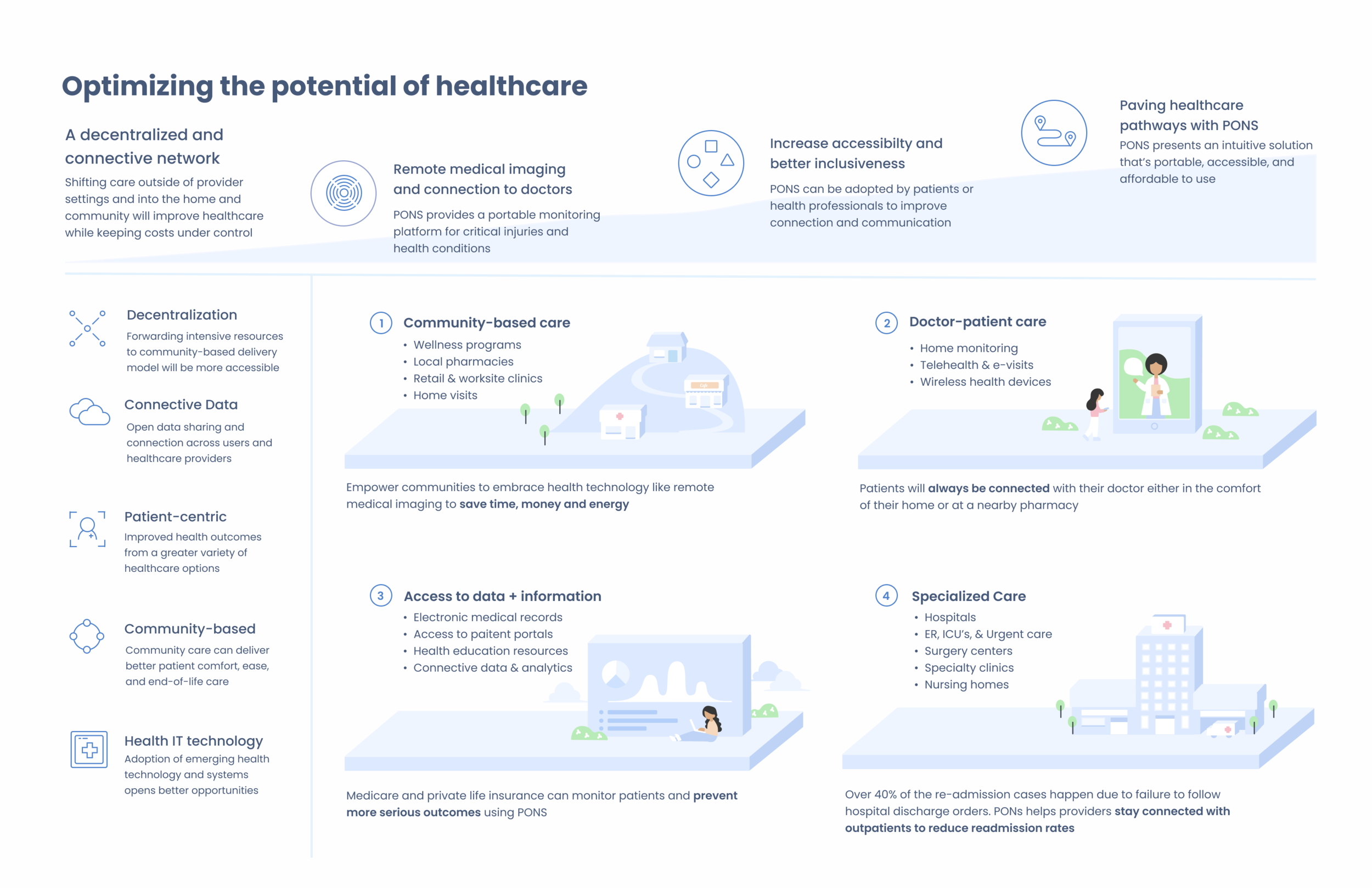
The solution was to create thoughtfully designed content ranging from informational graphics to an entire website redesign. My first task was to transform their 3 page website into something that gives off the presence of a friendly health tech start-up with the genuine ability to help people. The next step of the project was to transform the quickly sketched out value map into something cohesive and easy to understand for end-users. The infographics illustrate the customer journey of the patients as users navigating the decentralized healthcare system using PONs.
USER FLOW AND WIREFRAMING
My first task was to transform their 3 page website into something that gives off the presence of a friendly health tech start-up with the genuine ability to help people. I first researched health-related organizations and companies, understanding how they appeal to users across digital platforms. I studied their approach to messaging, tone, and visual design when it comes to media platforms. I sketched out multiple wireframes using shapes and lines then transitioned to creating lofi-prototype on Figma.
VISUAL DESIGN
I used Illustrator to create graphics and Photoshop to manipulate imagery I wanted to use for the UI design. After going and forth with the CEO, we laid out the foundation for the design and the website was ready to be manufactured. Using Wix, a web page platform, I built the entire site from scratch from design layout, manipulating graphics, and copywriting. Post launch, we got lots of positive feedback on the new site with multiple users excited to learn more about the product and even hoping to purchase it in the future. Since then, number of web traffic and newsletter subscribers have increased.
VALUE MAPS AND CUSTOMER JOURNEY INFOGRAPHICS
We needed to create a value map and easy-to-understand infographics to share with end-users, stakeholders, and investors. I created various redesigns of the original value map to make it cohesive and visually digestible for readers. Following the brand colors, I kept the tone of the map light and friendly with a focus on the different facets of the value network system. As for the customer journey maps, I focused on telling a narrative of the patient navigating the world of decentralized healthcare using PONs product and network. Using Illustrator, I created all the components such as icons and character illustrations.
Reflection
This one of my most rewarding projects to work on due to the nature of helping people in times where health is such an important part of our lives. I learned so much about health initiatives, future decentralization systems, and patient care. Through this project, I also learned how capable I was when it comes to learning new concepts and tools while developing and executing visual designs. I’m proud to say I practiced setting my own personal deadlines, staying on task while working remotely, and expanding creative skillset.


